Having a visually appealing website isn’t enough. Your site must also encourage visitors to take meaningful actions like signing up, making a purchase, or getting in touch. That’s where smart, conversion-focused design comes into play.
Modern web design trends focus on improving how users experience your site, making it easier to explore, and helping them stay engaged. These changes are more than just aesthetic, they’re built to guide users naturally toward taking action, which leads to better conversion rates.
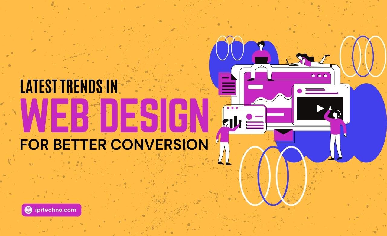
Let’s explore the top trends that can help boost your website’s conversion rate this year:
1. Minimalist Design with Purpose
Simplicity is powerful. Minimalist design reduces clutter and distractions, helping users focus on key actions like signing up, making a purchase, or requesting a quote. This trend emphasizes clean layouts, plenty of white space, and intuitive navigation.
Instead of overwhelming visitors with too much information or too many options, minimalist websites highlight essential elements that guide users through a smooth and focused journey.
2. Interactive and Personalized User Experiences
Modern websites are shifting toward personalized and interactive elements to keep users engaged. Smart recommendations, dynamic content, and interactive visuals adapt based on user behavior and preferences.
For example, e-commerce websites display personalized product suggestions, while service-based websites show relevant testimonials or content based on browsing history. The more experience, the higher the likelihood of conversion.
3. Micro-Animations and Motion Effects
Micro-animations are subtle yet powerful visual cues that guide users through a website. They can highlight buttons, illustrate changes in real time, or bring attention to a call-to-action.
However, the key is to use motion with intention. Overusing animations can distract visitors or slow down page loading times. Used wisely, micro-animations add an element of delight and interactivity that keeps users focused and engaged.
4. Mobile-First and Responsive Design
With a significant percentage of users browsing on mobile devices, a mobile-first approach is no longer optional. Google also prioritizes mobile-friendly websites in its search rankings.
Responsive design ensures your website looks and functions perfectly across all screen sizes. Menus, buttons, images, and content should all adapt smoothly from desktop to tablet to mobile.
Comparison: Mobile-First vs. Desktop-First Design
| Feature | Mobile-First Design | Desktop-First Design |
|---|---|---|
| Starting Point | Designed for mobile first | Designed for desktop first |
| Adaptability | Scales up to larger screens | Scales down to smaller screens |
| Load Speed Optimization | Prioritized for mobile data | Often heavier for desktops |
| Navigation | Simplified, thumb-friendly | More complex, mouse-based |
| SEO Advantage | Higher mobile ranking | May rank lower if not responsive |
5. Voice Search Optimization
As voice assistants become more widely used, optimizing for voice search is increasingly important. Voice-friendly websites focus on answering questions clearly and concisely. This means using natural language in content and structuring information in a way that voice search engines can understand.
Adding FAQ sections, using conversational keywords, and implementing schema markup are practical steps to support voice search functionality.
6. Bold Typography and Visual Hierarchy
Typography is now a central design feature rather than just a tool for readability. Large, bold fonts help communicate key messages quickly and clearly.
Visual hierarchy through varied font sizes, weights, and colors guides the user’s eyes through the most important sections of the page. This structure naturally leads users toward your calls to action.
7. Dark Mode and Low-Light UI Options
Offering a dark mode has become a user expectation. Not only does it enhance readability in low-light environments, but it also gives your website a modern edge.
Providing a toggle between light and dark modes gives users control over their viewing preferences — a small detail that can enhance user satisfaction and encourage them to stay longer.
8. Trust Signals and Social Proof
Visitors are more likely to take action on a website they trust. Design elements that build trust include:
- Verified customer reviews
- Case studies and testimonials
- Trust badges and certifications
- Clear privacy policies
Positioning these elements near CTAs can increase conversion rates by reassuring visitors of your credibility.
9. Accessibility-First Design
An inclusive website is not only the right thing to create, but it’s also beneficial for SEO and user retention. Accessibility-first design ensures that all users, including those with visual, auditory, or motor disabilities, can navigate your website with ease.
Features such as screen-reader compatibility, proper color contrast, keyboard navigation, and descriptive alt text enhance usability for everyone.
10. Fast Load Times and Core Web Vitals Optimization
Page speed remains one of the biggest factors affecting conversions. Users expect pages to load quickly, ideally within 2 to 3 seconds. A slow-loading website results in high bounce rates and lost sales.
Focus on optimizing images, reducing scripts, leveraging caching, and minimizing server response time to ensure your website meets Google’s Core Web Vitals performance standards.
Final Thoughts
Web design is constantly evolving, but one thing remains the same: a well-designed website converts better. By implementing the latest trends such as responsive design, clear calls to action, personalized user experiences, and fast load speeds, you can create a high-converting website that stands out and goes beyond.
If you’re ready to build or upgrade your website for better results, visit IPITechno to learn more. Our Web Development Services are personalized to help you increase engagement, improve conversions, and grow your online presence with smart, modern design strategies.
Comments are closed